Imagine this.
You’ve shelled out hundreds on ads in the past month, and it hasn’t driven any traffic. So, when you stumbled across a webinar on “How to make your Facebook Ads Actually Work,” you immediately registered. This guy seems like an expert, and you can probably learn a lot.
Five minutes before showtime, you click the link in your email to login and a countdown timer appears. You wait patiently as each second ticks down, and then you’re in, pencil in hand, ready to learn. And you see a guy in a wrinkled shirt with barbecue sauce stains and hair that hasn’t been combed in days.
Does he still seem so credible? For rib recipes, maybe. For business-boosting facebook ads…not so much.
Webinars, while online, are not so different from real life. What you wear matters (well the top half at least). But unlike real life, some rules that don’t apply in person do apply once a camera is involved.
Here are some clear no-nos you should avoid to make your webinar look professional and keep your audience attentive (and not focused on your Hawaiian shirt).
Dress for your industry

You may be working from the comfort of a home office while running a webinar, but you’ve got to dress for the environment your niche is in. If you work in business, a suit (or at least a button down) is appropriate and will give you a more polished look. However, for a fitness professional, a suit will look ridiculous (unless you’re Connor McGregor and thrive on being ridiculous). If you’re an artist, probably don’t show up in your paint-smattered smock, but an artsy shirt will do just fine.
It goes without saying that whatever style you choose to go with, always always always make sure it is clean and wrinkle-free.
Stay Away From Prints
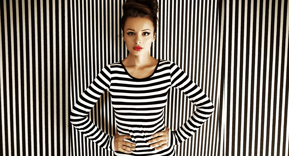
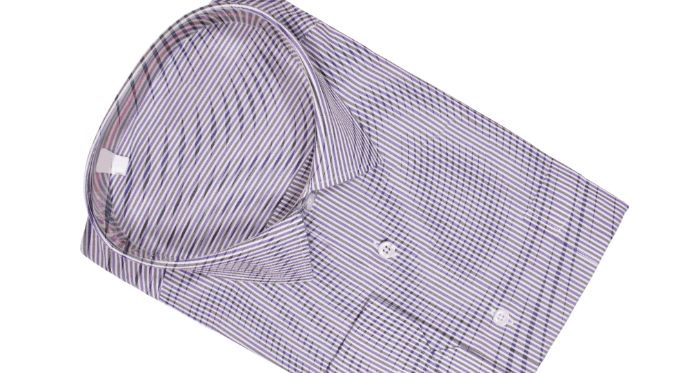
That striped shirt or polka-dot top might look fantastic when you’re out on the town, but on your webinar, it’s distracting. In fact, busy patterns, particularly those with high contrast pinstripes, herringbone or corduroy can create a “moiré effect.
A “moiré effect” is a visual trick that occurs on screens when an object has repetitive details that are too much for the camera’s sensor resolution. This results in a wavy-looking, somewhat rainbow pattern that will keep all the attention on your shirt or tie, and less on your presentation.
Cut Out High-Contrast Clothing

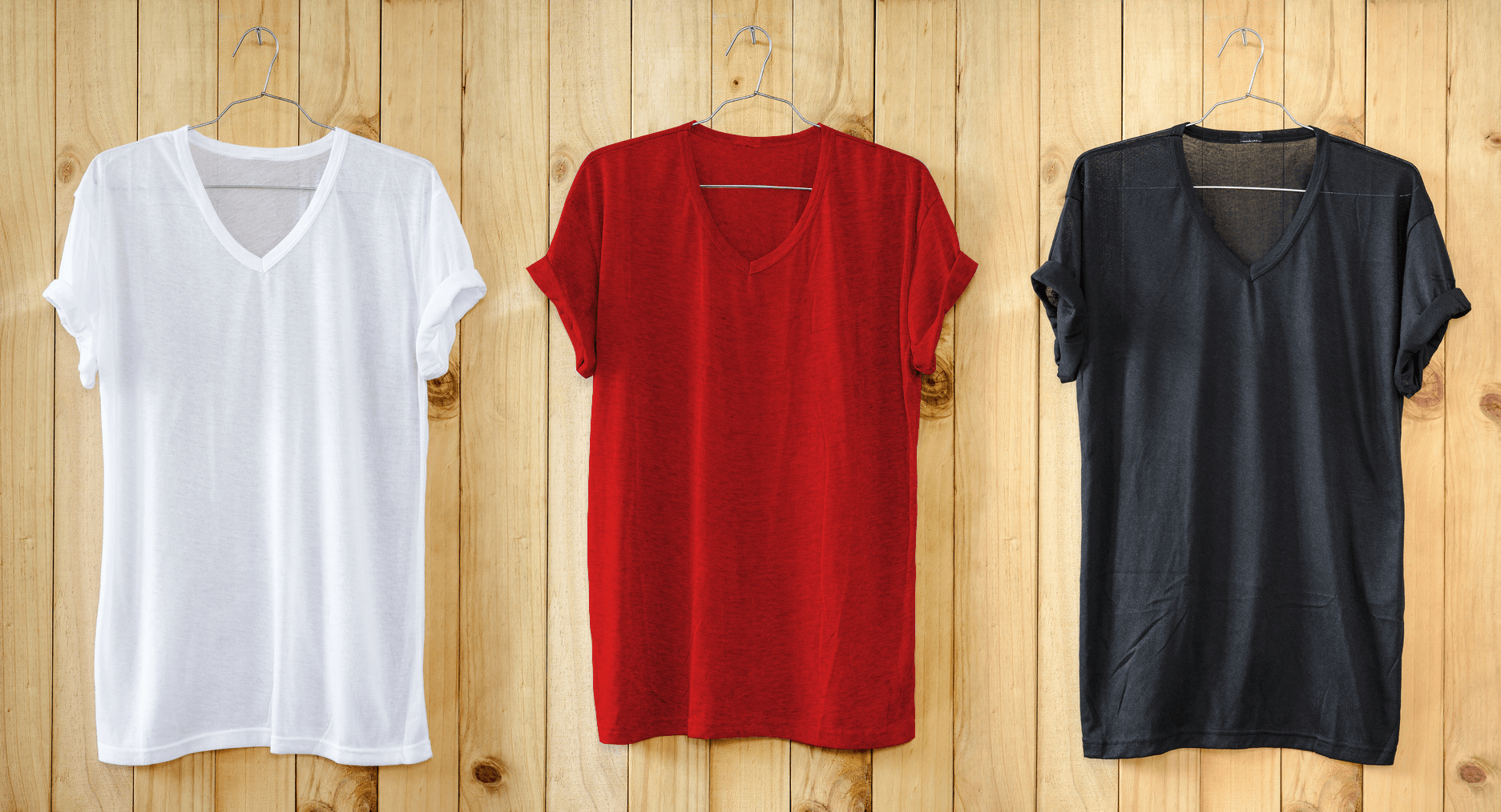
Video cameras (and webcams in particular) don’t handle high contrasts between bright and dark objects very well. That includes the contrast between your skin tone and your clothing. This means if you are very pale, avoid wearing black or very dark colors. In order for the camera to properly expose your face, your shirt will quickly become a black hole of nothingness. On the opposite end of the spectrum, darker skin tones should avoid wearing bright whites because the shirt will take on a glowing effect while the camera tries to correctly expose the face.
In addition to cutting out black and white shirts, cut reds out of your webinar wardrobe as well. I know red is a power color that stimulates action, but unless it’s a darker, deep hue of red, your webcam just won’t pick it up right. Instead, you’ll look like a glowing tomato, which isn’t a good look on anything other than pasta.
Instead, opt for solid blues, greys and pastels which tend to show up well on camera and won’t distract your audience.
The Only Thing That Should Sparkle Is Your Personality

A little bit of jewelry is fine, but skip any large earrings, statement necklaces and watches with extra “bling.” In addition to reflecting light from the room back into your camera (and blinding your audiences with flashes of white), loose or jingling jewelry can also affect the sound quality.
Yes, that silver chain with five pendants will clang when you emphasize a point, and your audience will hear it. Not to mention, you run the risk of banging into your microphone with large chains. Avoid competing for the best sound byte and stick to subtle jewelry that stays close to your person, such as stud earrings, a simple watch and choker necklaces.
Dress Up Your Background

So you’ve got a stellar outfit picked out that will only add to your presentation. But, your viewers are still distracted. You see, your kid’s legos in the background and that huge stack of mail on the counter and the crumpled up notes in the corner are all distracting. If you’re going to take the time to make yourself look professional, make sure your webinar background looks professional too.
This means either investing in a good backdrop (again, try to stay away from a stark white, pitch black or red), sitting against a nicely-colored wall or hosting your webinar in a simple and classic setting, such as by a fireplace or in a clean office, with some indoor plants.
***
Whichever outfit you choose the day of your webinar, aim for a neutral reaction. Unless you’re a stylist, you don’t want your clothes to steal the spotlight. And please, (if only because your mom has told you 1000 times) brush your hair before you go live.
Bonus tip: You can further improve the look of your presentation by investing in a lighting set or ring light.


